
As Head of Design at Executive Grapevine, I was responsible for all of the client whitepaper projects. As part of these packages, I would work with these clients to design and develop a fully branded whitepaper. The process would come from a written report supplied as part of a survey, which editorial would then write up as part of the copy, to go into the final product.
The Skillsoft example shown here, will take you through my process.
The Skillsoft example shown here, will take you through my process.
Once establishing the title and focus of this whitepaper, I liaise with the client regarding logos and other elements that will help me in achieving a professional looking and correctly branded design.
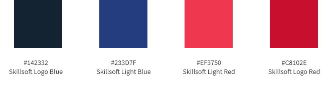
Skillsoft's colour pallet, with some slight adjustments
to allow me some creative adjustment on elements.
to allow me some creative adjustment on elements.

After reviewing the client's website and looking over what brand elements they could supply, I sourced the fonts there were using. Using Montserrat as the main brand font and using Open Sans as a body font, this would allow their Montserrat to stand out within the pages, for stats or breakouts.
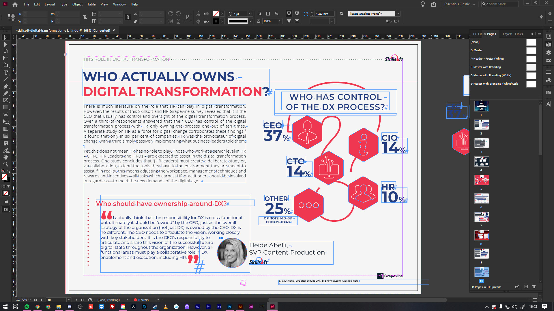
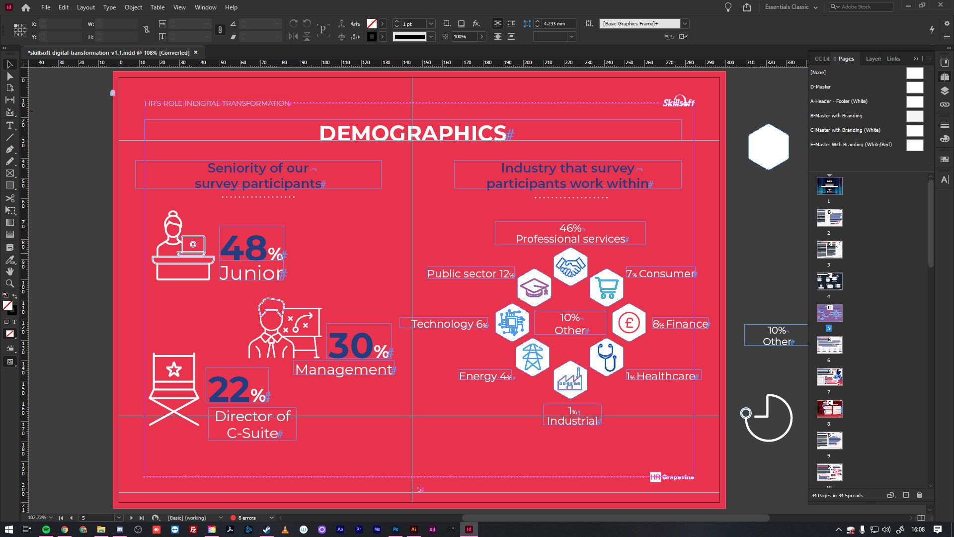
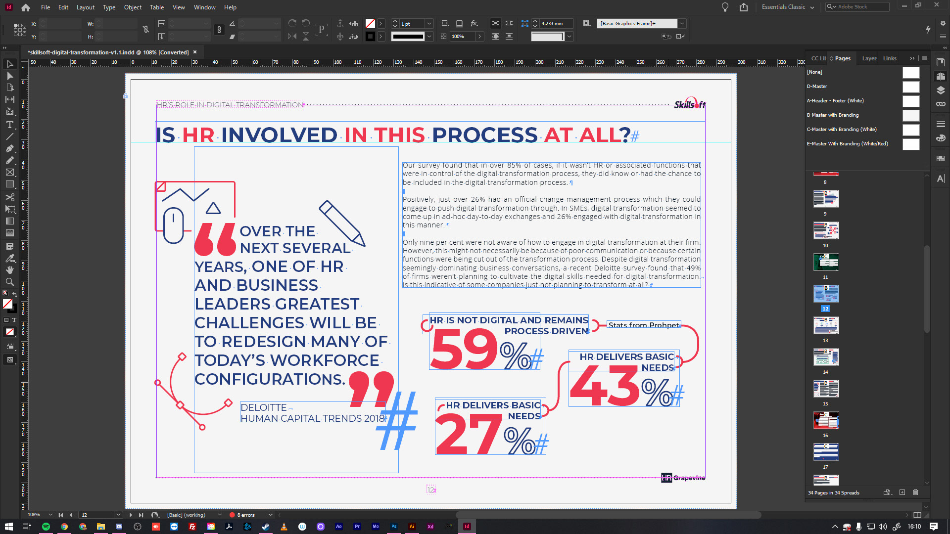
Now that I had the fonts, colours and logo elements I needed. I then started the process of reviewing the working copy from the editorial team and how I would set each page with the headings the editor had chosen, as well as the stats that would accompany them.
Now that I had the fonts, colours and logo elements I needed. I then started the process of reviewing the working copy from the editorial team and how I would set each page with the headings the editor had chosen, as well as the stats that would accompany them.

Working with the editor, we agreed the theme and title with the client. This was around the world
of digital transformation, so I took that as my main focus when designing this whitepaper.
All design elements and icons throughout this whitepaper I created via Illustrator.
of digital transformation, so I took that as my main focus when designing this whitepaper.
All design elements and icons throughout this whitepaper I created via Illustrator.
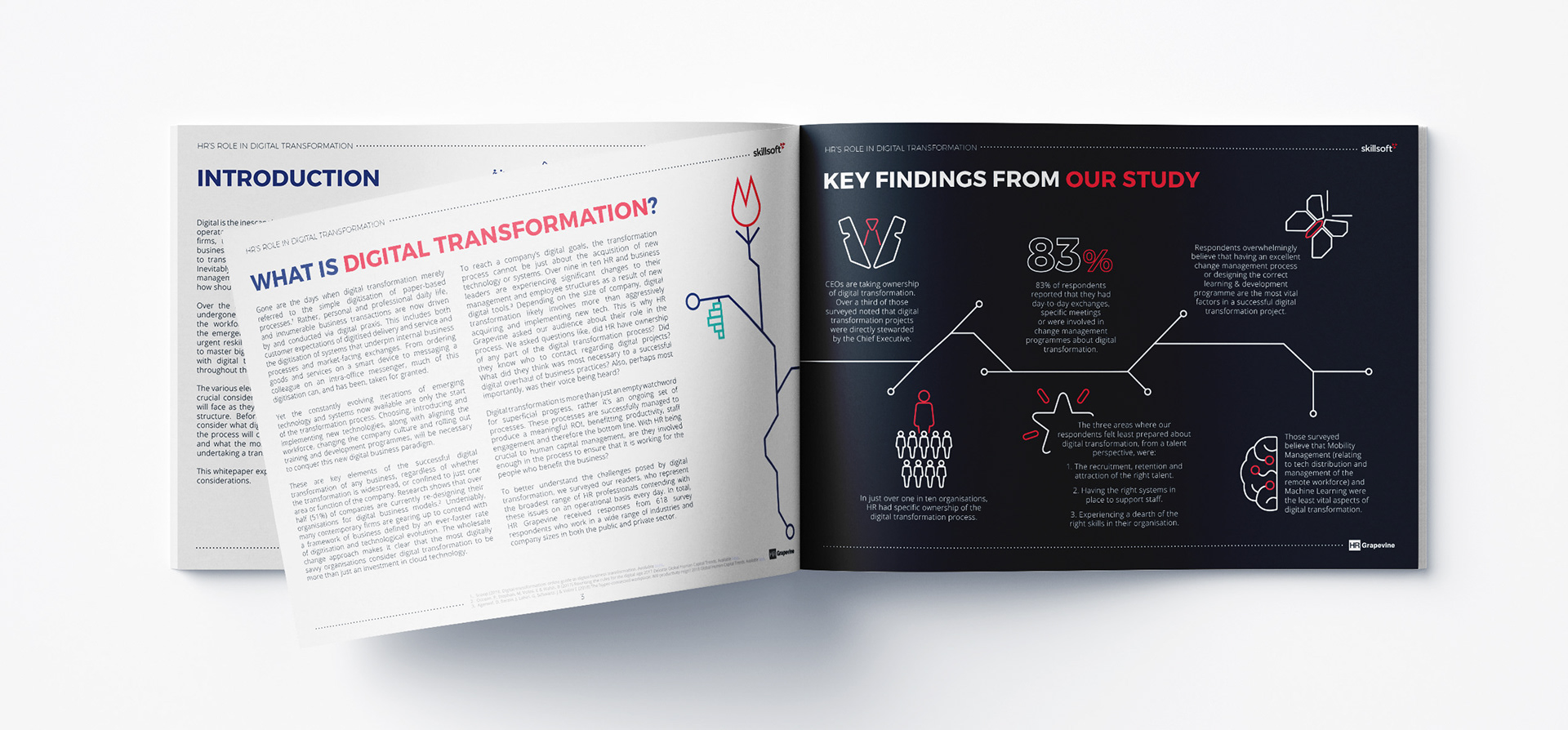

This whitepaper featured some case studies from well known brands, Fujitsu, Starbucks and Canon.
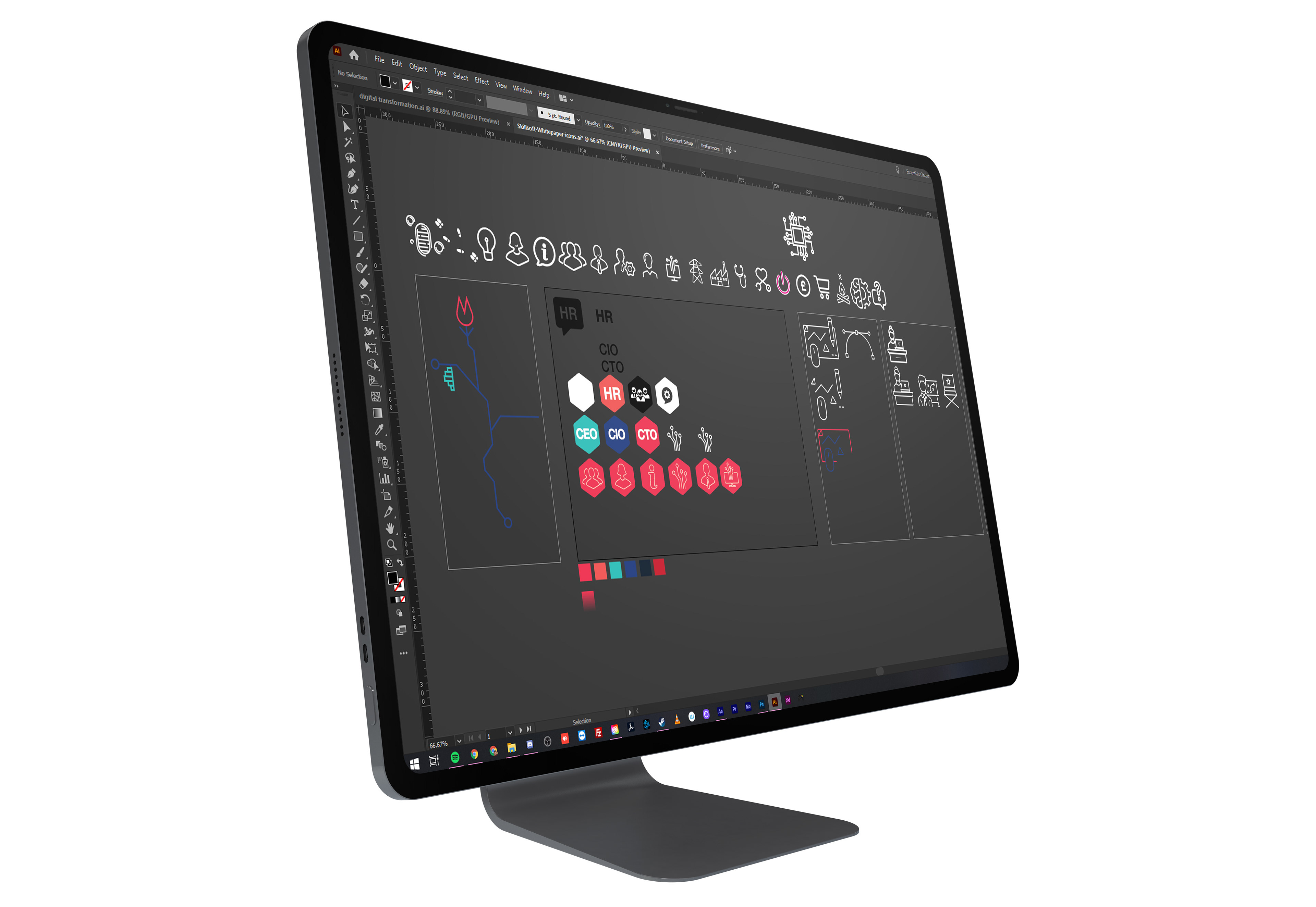
While working through this project I was gathering and creating a collection of icons for use in this whitepaper.
All of the elements I used were created in illustrator,
as you can see here.
All of the elements I used were created in illustrator,
as you can see here.