Over my 5 years at Executive Grapevine I've worked on a number of their publications, covering
topics of varying natures for both the HR Grapevine and Recruitment Grapevine magazines.
topics of varying natures for both the HR Grapevine and Recruitment Grapevine magazines.
Through the process of working on these covers, I spent time with the editors for each, drafting ideas from their cover stories and interviews. Advising them on title tweaks and generally bouncing ideas, from sketches to mock-ups, through to the final publication.
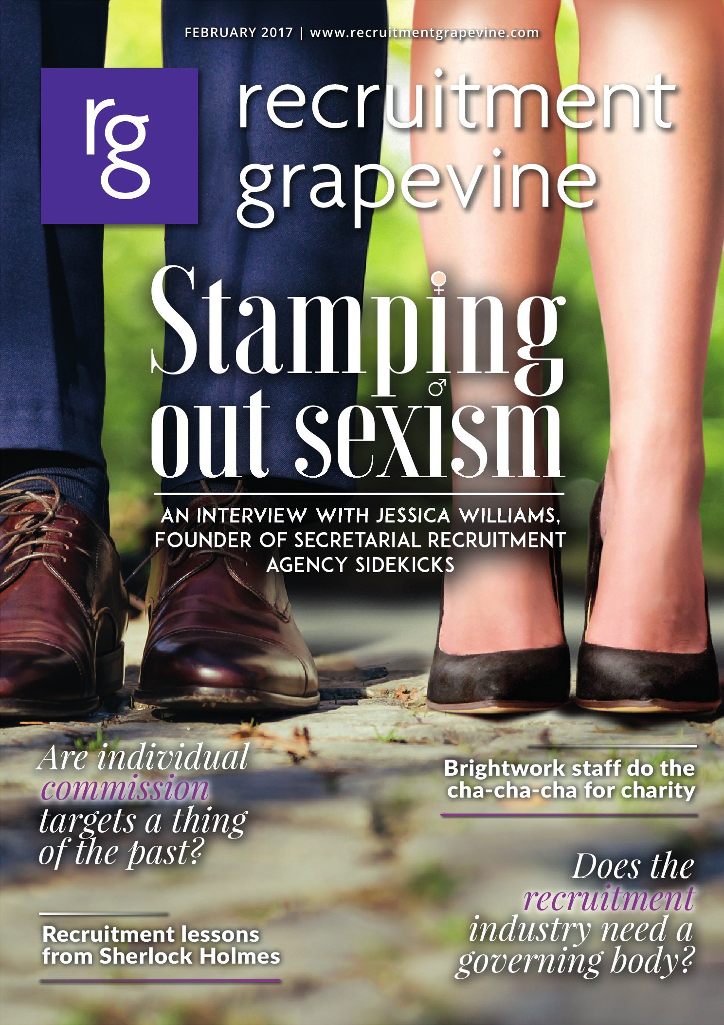
The process for building one of these covers for their recruitment stories was quite different from how we would go about a cover for HR Grapevine since HR would focus around a well-known brand and RG would give a spotlight to a recruitment firm or topic in the recruitment industry.
I would be given a couple of headlines/titles from the editor, at which point I would go away and generate a mood board around the subject. After that is prepared we would go over the images together until the most fitting was decided upon. Once that had been agreed, I would spend my time pulling assets together from various stock image sites to create the examples you see below.
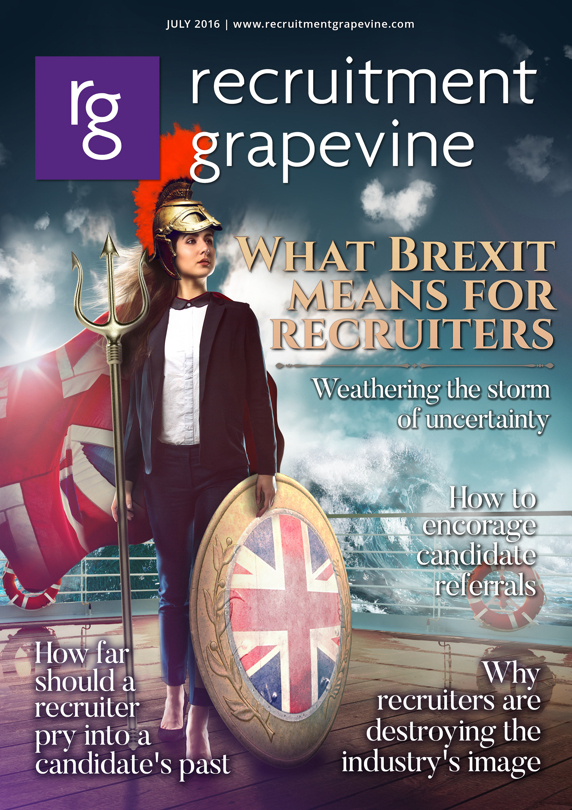
This cover art to took the form of a recruiter as Britannia.
The topic focus was Brexit and recruitment.
The topic focus was Brexit and recruitment.
To get to this final design it had many iterations and elements needing to be pulled together from various stock images. Originally we wanted to position the woman as Britannia in the middle of the cover design, after adjusting titles around on the page I felt that it was stronger with the title off to the right of the woman.
Preview the fullpublication here

Cover feature design from Recruitment Grapevine, this issue featured the very well known CV Library.
CV Library have their owl as their mascot, so felt it was only fitting to use that as our statement image for this cover. This cover design is a mix of stock elements and photoshop brush artwork. The final cover product was animated, with the owl hovering above the open book.
CV Library have their owl as their mascot, so felt it was only fitting to use that as our statement image for this cover. This cover design is a mix of stock elements and photoshop brush artwork. The final cover product was animated, with the owl hovering above the open book.
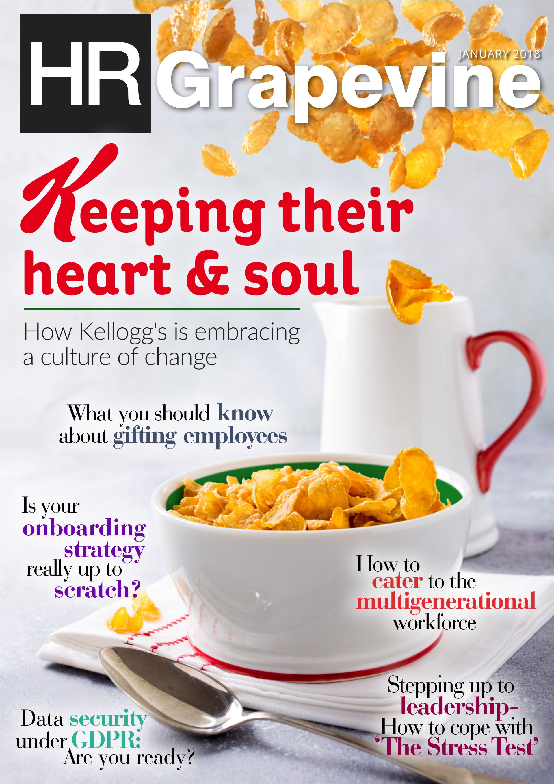
In January of 2018, HR Grapevine had a cover feature with Kelloggs.
With this cover design, it was important to keep the main brand present, using their iconic K from their logo and keeping their brand font for our title copy. Not forgetting the red, white and green, which features on the boxes of Kellogg's Cornflakes. The final cover featured animated cornflakes floating off on the right side of the bowl, which you can see via the preview link below.
Preview the full
publication here
Below are some more examples of covers and the processes of development
from my time working on the HR Grapevine Publications.
from my time working on the HR Grapevine Publications.

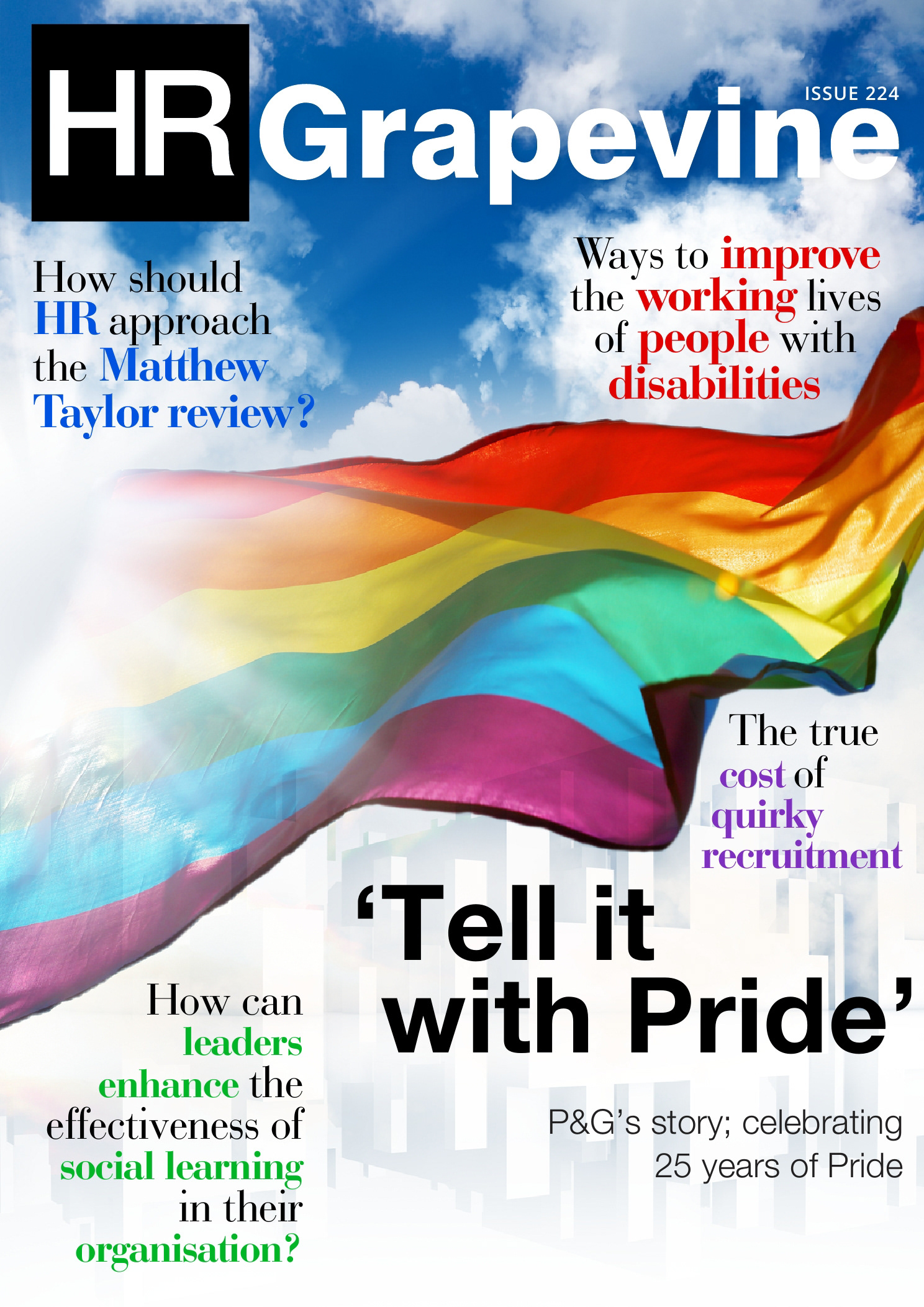
This collection above are a few variations for that cover design with P&G in September 2017.
The editor and I wanted to give full focus of the topic on the cover, making sure the audience could easily distinguish what we were talking about in this months issue of the magazine. This particular issue covered how P&G were showcasing their story of Pride, and the 25 years they have been attending as a company. This led to the flag or the idea of the colours as paint over a clean company background.
The editor and I wanted to give full focus of the topic on the cover, making sure the audience could easily distinguish what we were talking about in this months issue of the magazine. This particular issue covered how P&G were showcasing their story of Pride, and the 25 years they have been attending as a company. This led to the flag or the idea of the colours as paint over a clean company background.

In October of 2017 we featured Starbucks for the cover of HR Grapevine magazine.
This cover design started out very simple, before expanding towards their main feature that arrives in October each year, the pumpkin spiced latte. The designs above are a collection of images from Starbucks image libraries and Shutterstock images, all retouched and composited in Adobe Photoshop.
This cover design started out very simple, before expanding towards their main feature that arrives in October each year, the pumpkin spiced latte. The designs above are a collection of images from Starbucks image libraries and Shutterstock images, all retouched and composited in Adobe Photoshop.
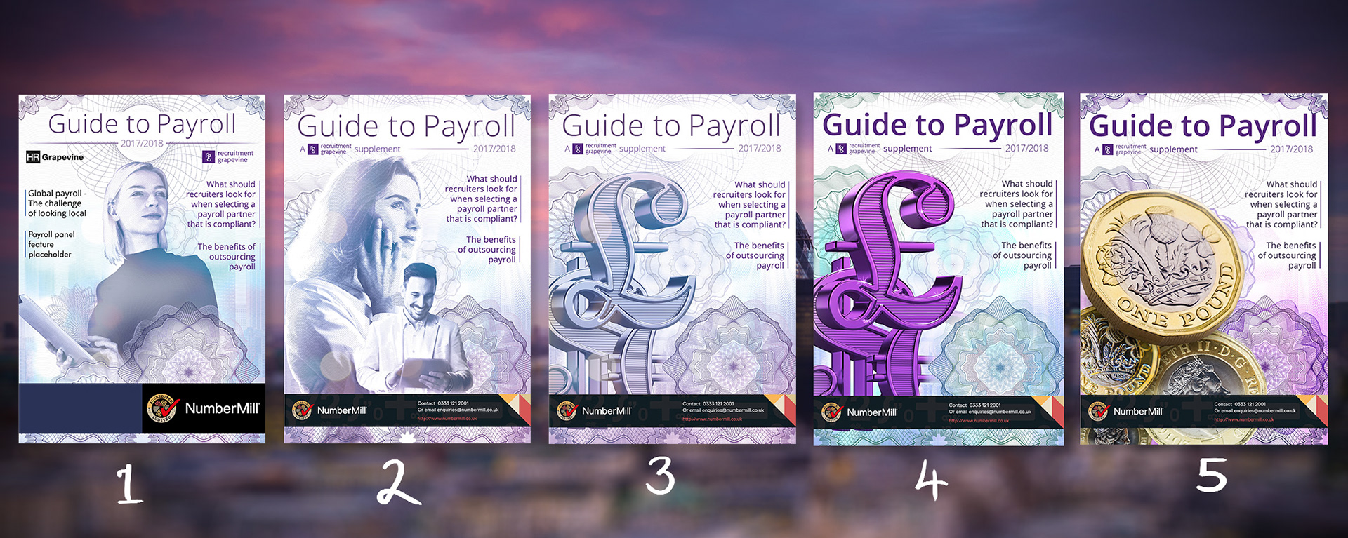
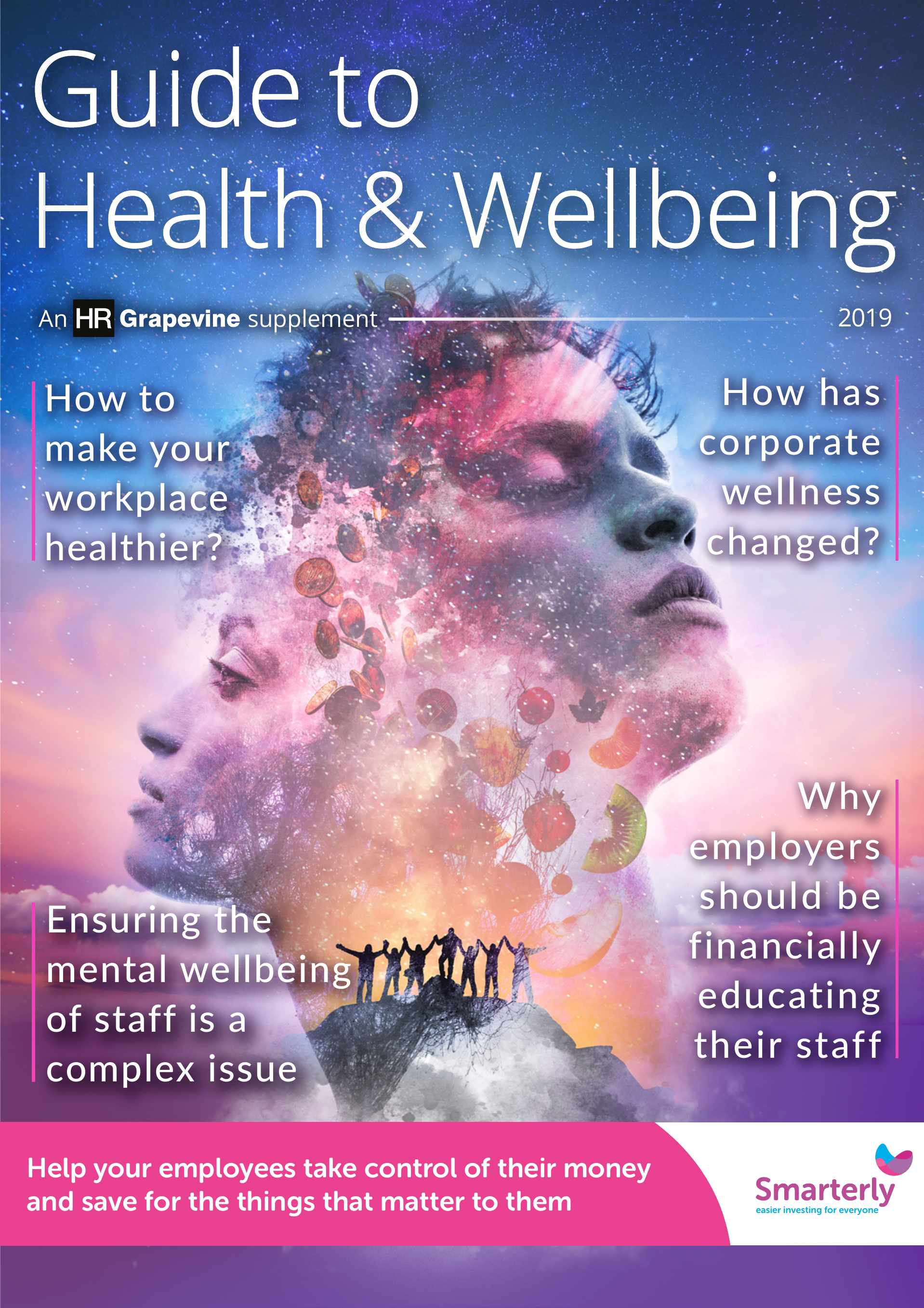
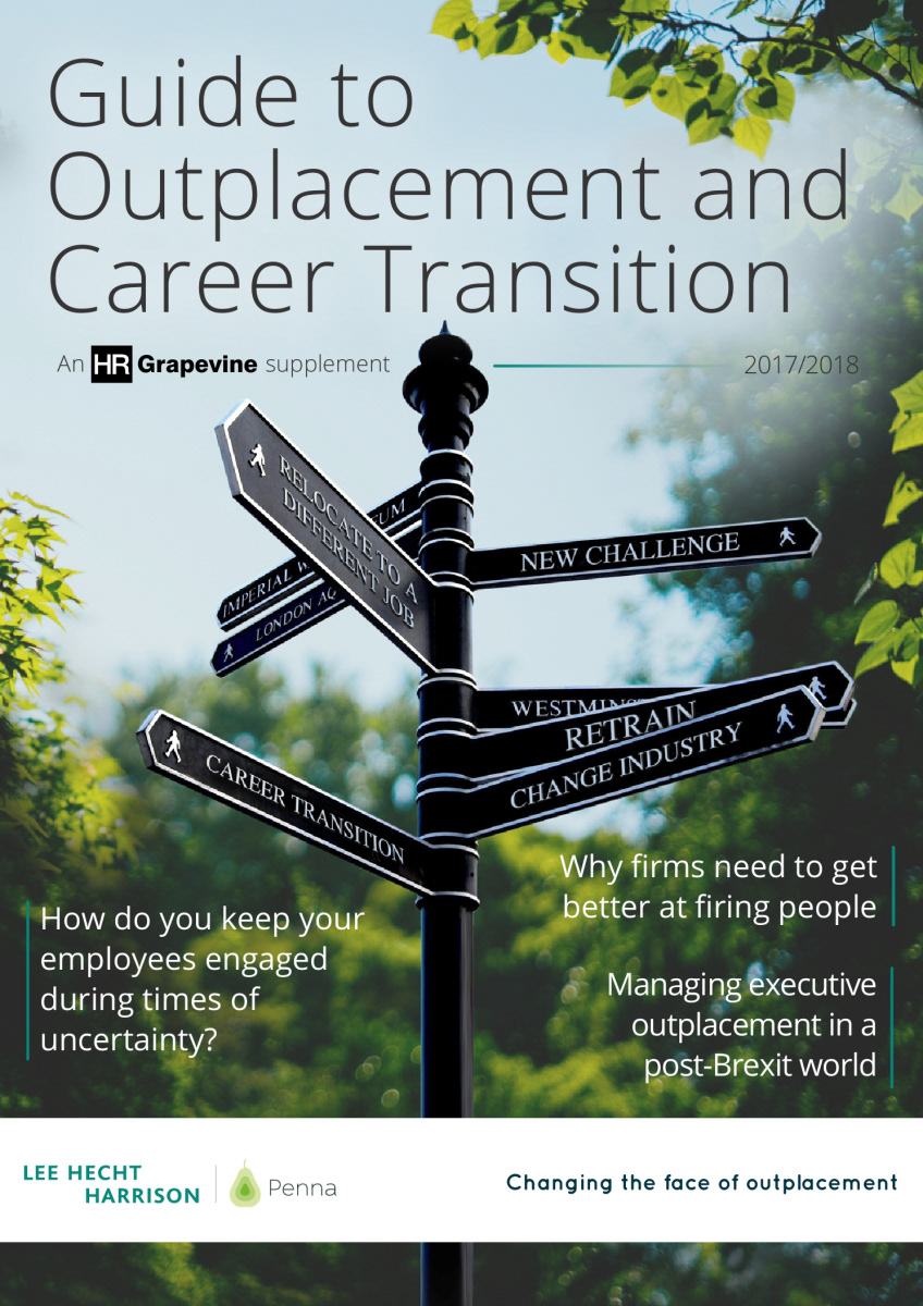
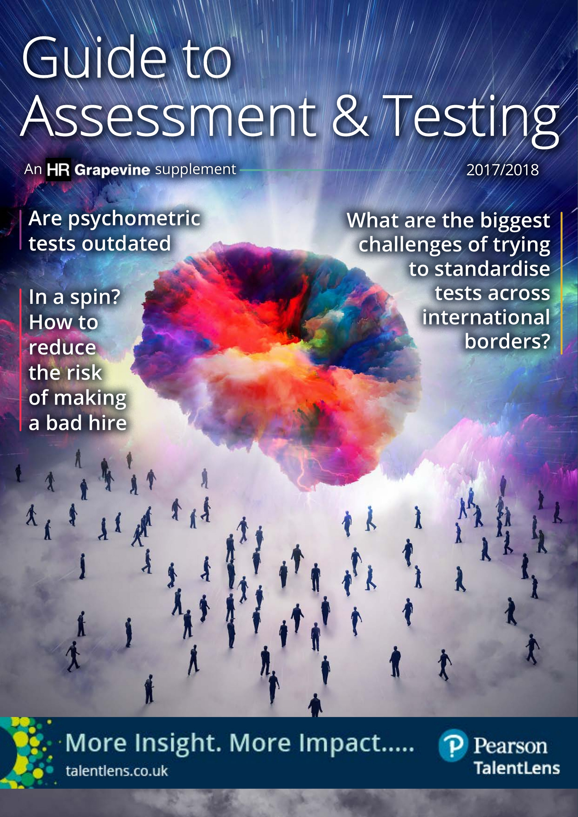
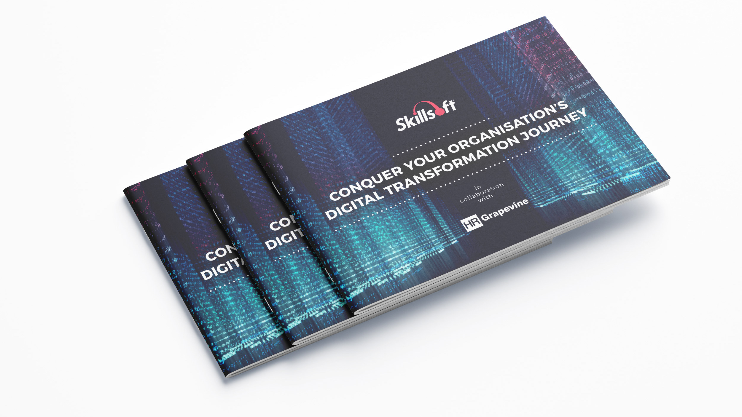
This is an example of one of the industry guides, which would be published once a month along side other publications and cover a variety of different topics in the HR and recruitment sectors.
My aim for this cover for the Guide to Payroll was to try and achieve an effect of halftone lines to emulate the look you see on notes of money. For this I spent sometime experimenting with the filters in Illustrator and Photoshop and finding the correct subjects for the cover below.
My aim for this cover for the Guide to Payroll was to try and achieve an effect of halftone lines to emulate the look you see on notes of money. For this I spent sometime experimenting with the filters in Illustrator and Photoshop and finding the correct subjects for the cover below.

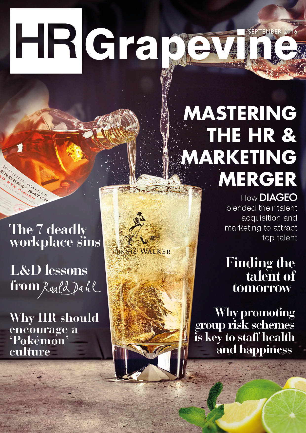
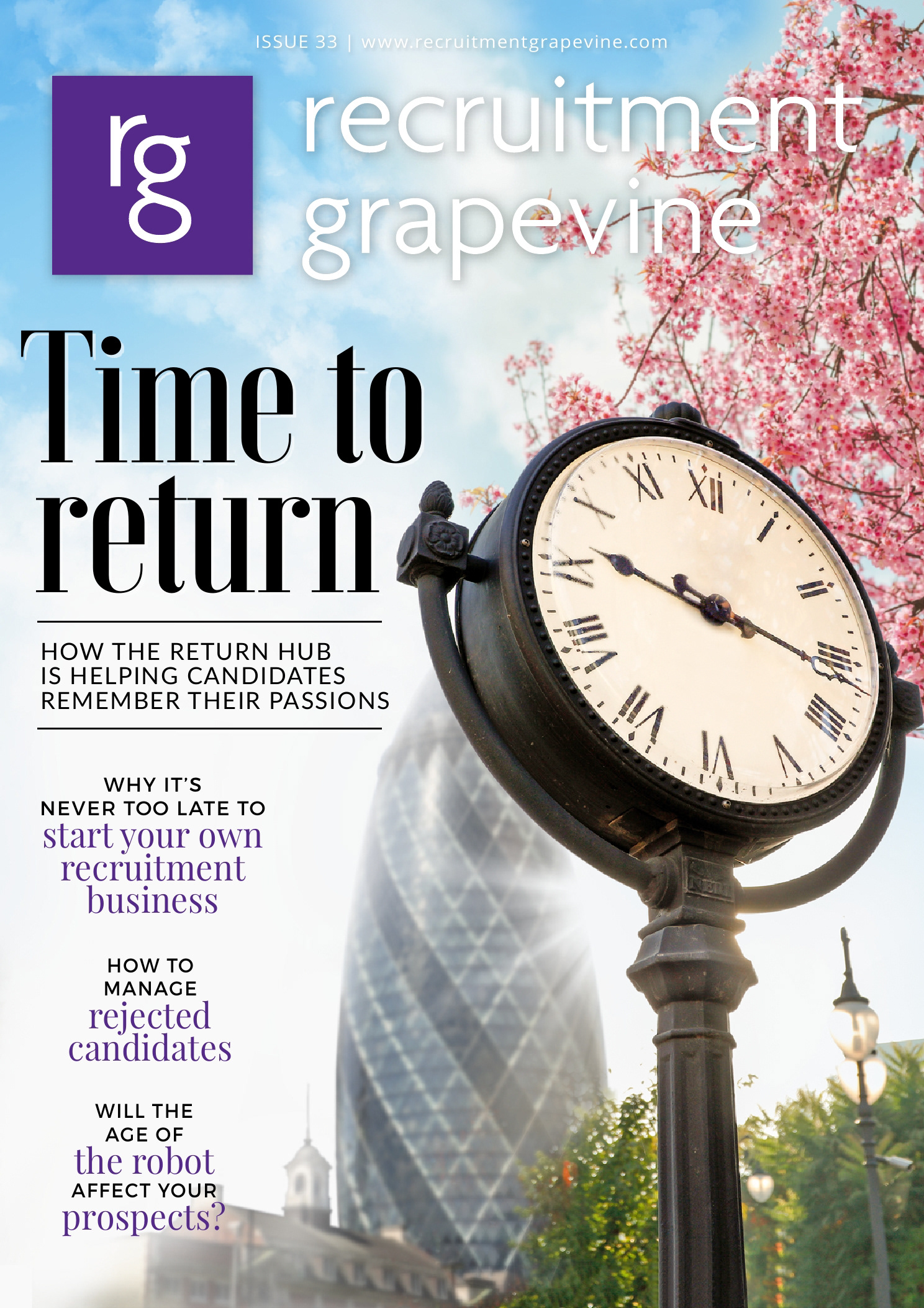
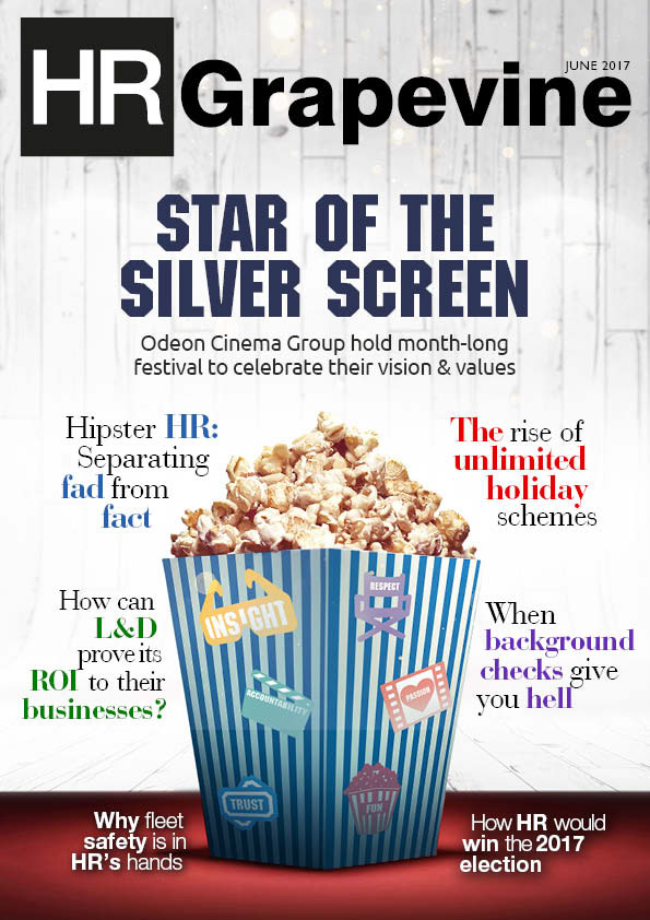
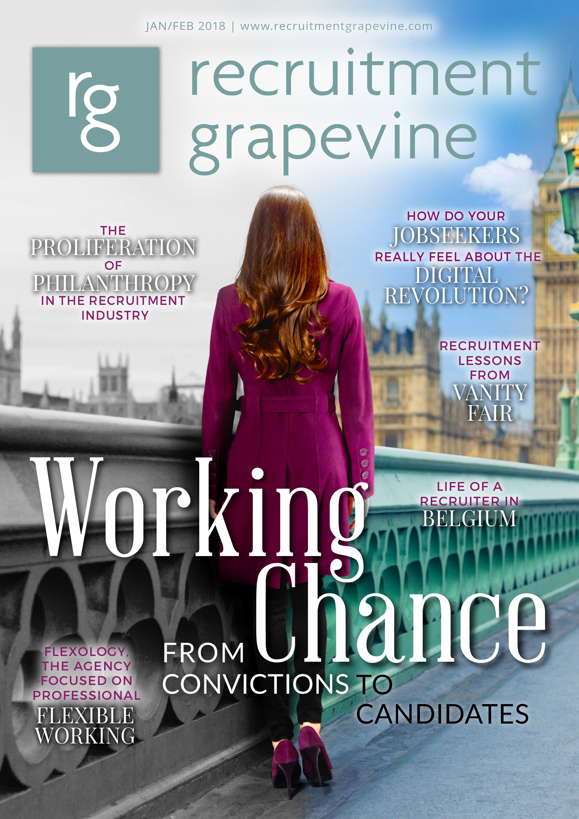
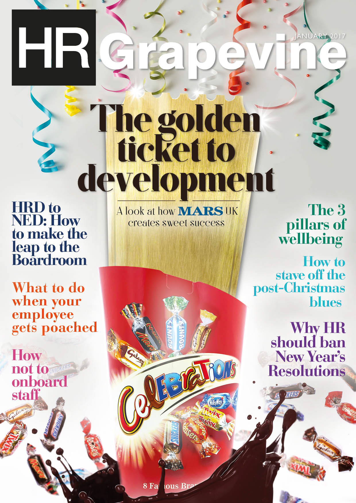
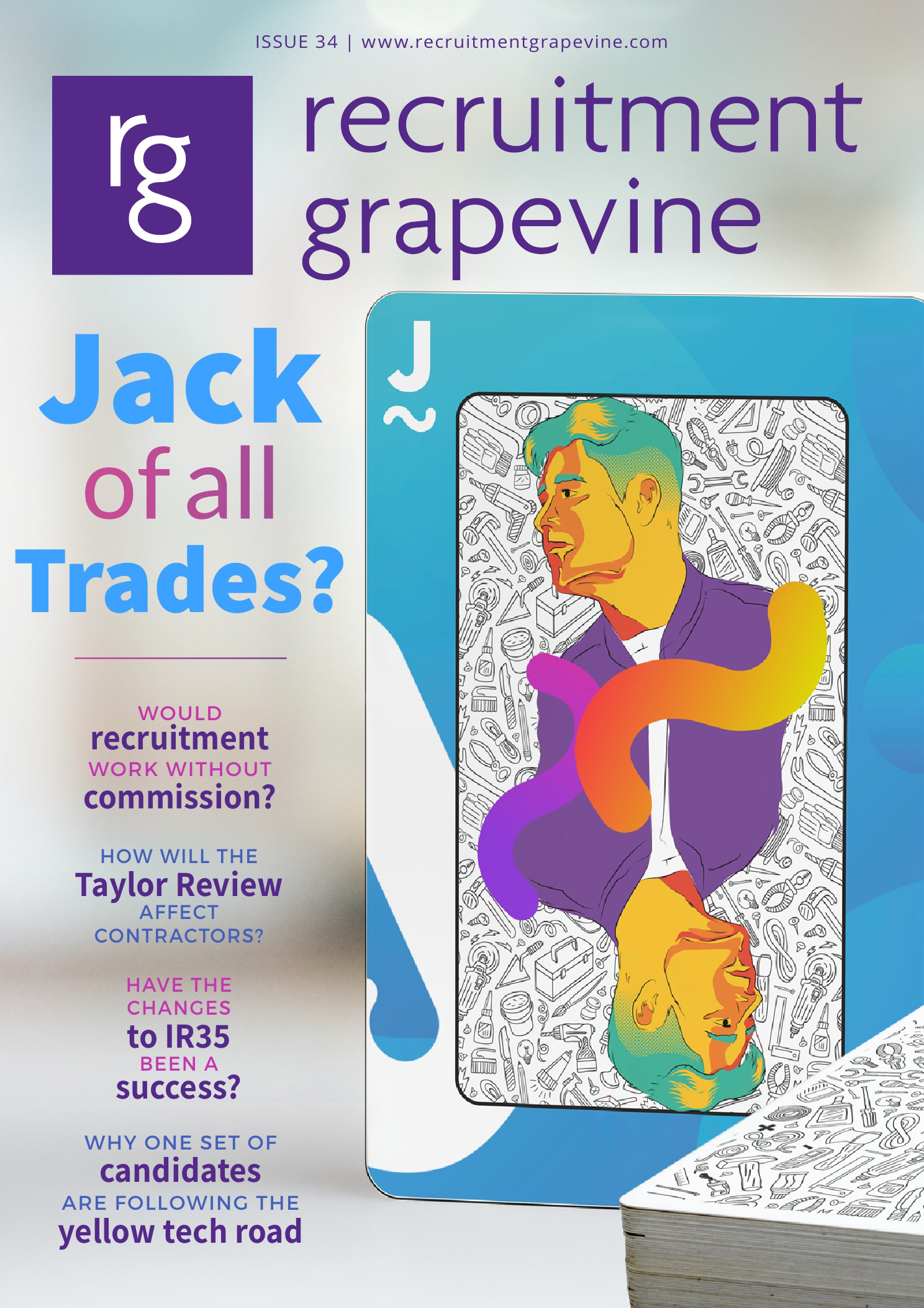
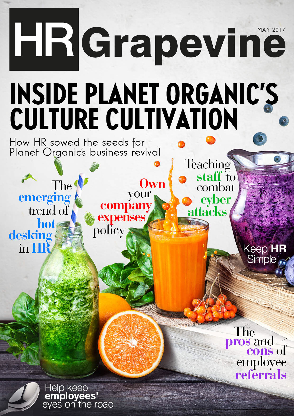
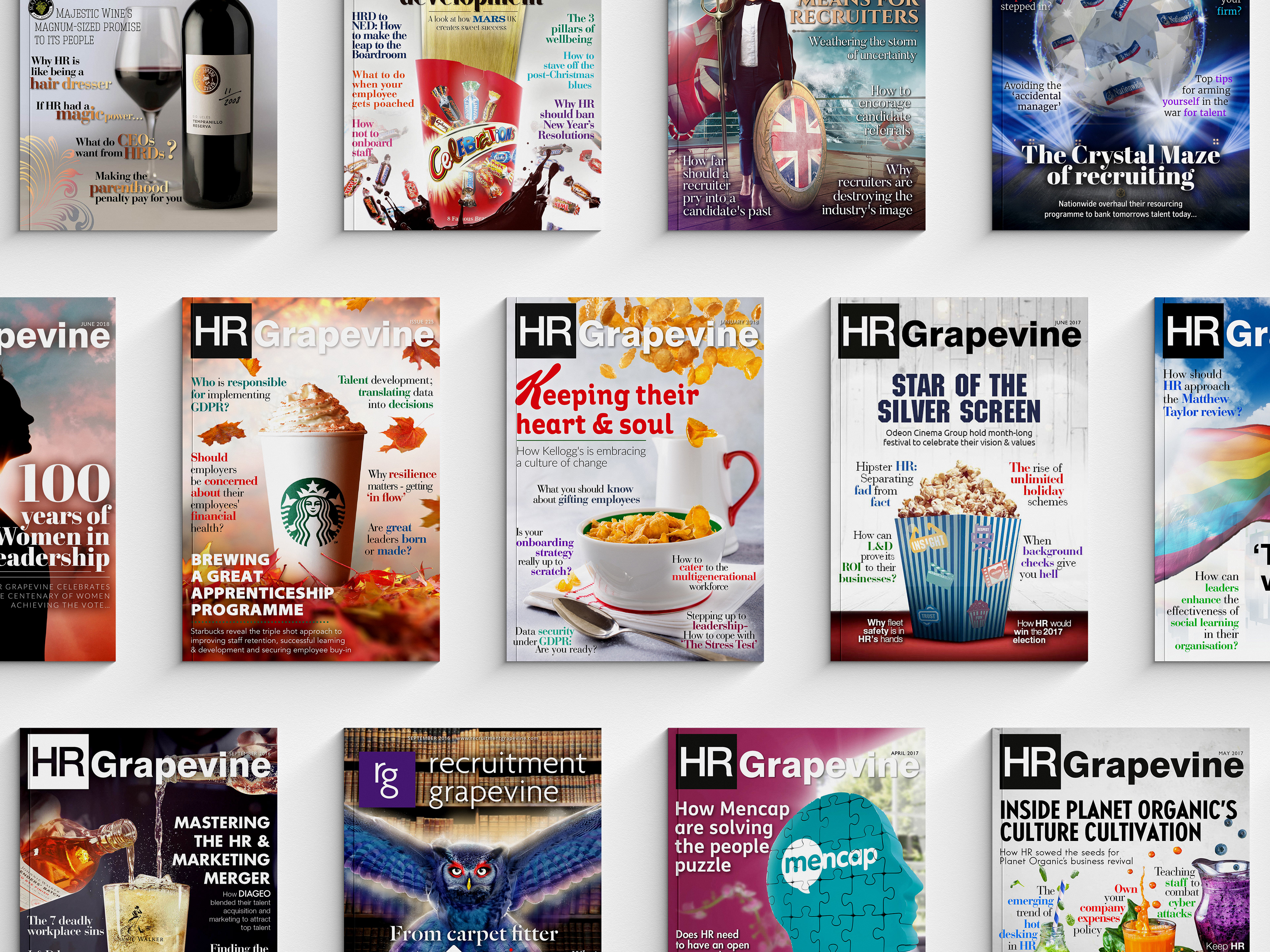
Cover designs below are some of which I create from 2015 to 2018.